• Product Design
  • Visual Design
  • Fine Art
  • CONTACT
  • Menu

Y T T L ..

  • Product Design
  • Visual Design
  • Fine Art
  • CONTACT

→ LinkedIn

→ Resumé

→ Google Scholar

Builder’s Connect

User Interactive/User Experience Design for Persuasive Web Application (PWA) for Energy Company

Builder's Connect

July 14, 2023 in Web Design

This is a project from client that we build a new, customer-facing Progressive Web App (PWA) portal for Southern Company to help manage the run service/set meter process for new construction.

Southern Company is an energy industry company specializing in power utilities, operating across three different southern states. The mission of our consultant team is to aid customers in setting up electricity for new residences, condos, and buildings. We focus on comprehending the user journey and the needs of both external and internal stakeholders in order to create user interface screens tailored to five specific roles. Our workflow includes creating sitemaps, wireframes, and a customized design system for our client. We collaborate closely with business analysts, developers, stakeholders, and clients, consisting of an internal team of 20 people.

*Please fill in the form below to contact me if you would like to learn more about the project or get access to a secured cased study ⬇️

Name *
Thank you!
Comment

Honda Electric Vehicle Simulator

User Interactive/ User Experience Design

Honda Electric Vehicle Simulator

August 17, 2022 in UI, UX

Table of Contents:

  1. Summary

  2. Problem Statement

  3. Stage 1: User Research

  4. Stage 2: Concept Ideation

  5. Stage 3: Design Process

  6. Stage 4: Final Design Solution

This project is sponsored by Honda as a Capstone project for the MIIPS program at Carnegie Mellon University during the Spring 2022 semester. The purpose of this project is to create a solution to alleviate the range anxiety of electric vehicle (EV) users from internal combustion engine vehicles (ICE). This project aims to alleviate range anxiety for Honda customers and build confidence that it will never be a problem via daily usership of users’ EVs. We believe this solution could help Honda improve and increase its potential EV customers in its future EV market plan.

Comment

Alibaba Xiniu Manufacture

User Interactive/User Experience Design/Digital Fashion and Fabric Platforms

Alibaba Xiniu Manufacture

August 01, 2021 in UX, UI

This is the second project I would like to introduce with. It is the project I did during my internship with the Taobao team, which is the Chinese Amazon at Alibaba. I worked for Xiniu manufacture, a series of digital fashion projects including a B2B online platform and a B2C 3D modeling and video.

In collaboration with a team of engineers and product managers, I invested a significant portion of my time shaping the fundamental structure of the platform of fashion-production management for the fashion factories, the instant messaging section, and the 3-D digital fabric depiction which showcases the material textures. My role encompassed the full spectrum of the project, from initially identifying the problem to finalizing the design of the minimum viable product (MVP), formulating the feature roadmap, and coordinating closely with engineers to refine the final hand-off details.

Comment

Groop

Campus Interaction Application

User Interactive/Experience Design

GROOP: On Campus Interaction Application

April 22, 2021 in UI, UX

This project is to design a mobile phone user interface for college students to socialize in the post-pandemic era. The purpose of this application is to encourage students to hold events and activities on campus based on their studies and entertainment in the situation of being isolated because of Covid-19. With this application, students can have meetings and all types of events based on their course codes and meet with students and faculties in the same course without having their contact information.

ppt.004.png ppt.005.png
ppt1.001.jpg ppt1.002.png
Interview presentation copy.015.png 2.001.png
1.001.png 1.002.png
1.gif
2.png
3.png
4.png
5.gif
1.gif 2.png 3.png 4.png 5.gif
Comment
Screenshot 2021-01-05 at 3.59.38 AM.png

Websites of Divinatory Methods

December 22, 2020 in UI, UX, Web Design

Concept

The two websites in this series mainly discuss the content of divination superstition. The first website researched the floor plans of houses through Feng Shui from China, and added interactive functions to the website. The second website compares two divination techniques (divinatory sticks and tarot cards) to determine whether people should rely on divination.

Target

  • Consumer age range: adult

  • Target audiences:

    • people who do not believe in divination

    • people who want to know different divinatory methods through the one they are familiar with

1st Website: Feng Shui of Floorplans

Inspiration

My first project originated from the recent experience of a relative who just bought a house. He hired a Feng Shui consultor for suggestions of buying house properties, and he finally chose the one that I thought was not as ideal. However, in less than half a year, he made a fortune from running a medical business because of the Covid-19 pandemic. He attributed it to his good Feng Shui house. I started to wonder whether the house can really change fate, so I started to study the Feng Shui of the houses and made it the subject of my first project.

Click to view
Screenshot 2021-01-04 at 3.35.29 AM.png
Screenshot 2021-01-04 at 3.35.50 AM.png
Screenshot 2021-01-04 at 3.36.14 AM.png
Screenshot 2021-01-04 at 3.36.34 AM.png

Purpose

I try to explore the concept of Feng Shui through the lens of the advantages and disadvantages of different floorplans. This design intends to speak to the people who want to know how those so-call superstitious methods influence their daily life, and for the people who plan to buy a property and are interested in this aspect.

This design aims at not only warning the audience about the Feng Shui shortcomings that they need to avoid when buying a house but also helping them comprehend what kind of positive characteristics their new place should have had for living.

 
Screenshot 2021-01-05 at 4.06.47 AM.png

2nd Website: Discrepancy Divination

Inspiration

Extending from the first project, I began to want to promote the concept of Feng Shui from the perspective of propaganda. I learned that not many people know this divinable knowledge, and some even don’t believe that these so-called symbols or knowledge can symbolize their future. Thus, I start to prepare to explore different divination methods and their respective content, by the lens of showing their respective steps and divination results:

Is the divination process shocking?

Can the divination result accurately predict the final result?

By showing the process of divination and the results of divination, tell the confused people whether they should rely on these divination results.

Purpose

The goal of this work is to show the difference in the process of different divination methods. The objects of comparison are fortune-telling methods from the East vs. the West, which are divinatory sticks and tarot. I will record the process of my personal experience in the form of a website and put it together for comparison, hoping to explain the results of the two divinations and see whether they can predict the future or not.

 
Screenshot 2021-01-05 at 4.11.48 AM.png
Comment
Screenshot+2020-11-29+at+4.34.36+AM.jpg

Xiaomi Smart Home Application

User Interactive/Experience Design

Xiaomi Smart Home App

November 22, 2020 in UI, UX

This project is to design a mobile phone user interface for Xiaomi Smart Home software. Xiaomi Smart Home is a complete set of closed-loop experience composed of smart hardware products of Xiaomi Eco-Chain Enterprise. The Xiaomi Smart Home APP is a unified device connection portal, deeply integrated into the MIUI system, and the lock screen interface integrates the device control center to simplify the operation process and facilitate users to quickly connect and use Xiaomi smart hardware devices with one click.

Branding Requirements

  1. Cozy feeling. This software focuses on smart homes. The purpose is to let users experience the warm feeling of home while they are using.

  2. User-friendly. The software has a broad audience - both male and female; the youth and the aged; the tech-newbie and the expert. So the software interface should be in explicit language and inclusive to all the target users.

  3. Follows the trend of design. Recent design trends are characterized by flatness and roundness.

  4. The use of colors should conform to the brand's positioning.

Wireframe Design

Beginning interface

#1 Beginning Interface

These two interfaces are the interfaces displayed when the software launches. The one on the left is the buffer interface, and the picture in the middle will be placed with illustrations or advertising banners. On the right is the interface for the user to log in to the software.

Home Interface

#2 Home Interface

These five interfaces are the “Home” page.

  1. Room display: Because this software aims to facilitate the use of smart homes, the room options are displayed when the software launches. Users can view the smart home appliances in each room by clicking on each thumbnail/card.

  2. Add button: Users can add a new room or new device by clicking the plus sign in the upper right corner.

  3. Equipment display #thermostat: This display is the exclusive setting page of the thermostat. The user can control the temperature through the dial on the right. There are buttons to control cooling, heating, and settings in the lower-left corner.

  4. Equipment display#main lights: This is the exclusive setting page of lights. The user can control the brightness of the light through the dial on the right. There are buttons on the lower-left corner to control the bulb's wattage and adjust the color of the light.

  5. Equipment display #thermostat setting interface: This shows the thermostat setting page. Users can control the cooling, heating and fan buttons through the upper part. There are plus and minus buttons on the left and right sides to control the temperature. Shown below are indoor temperature and humidity and outdoor temperature and humidity.


Statics Interface

#3 Statics Interface

These three interfaces display the data of the room. The software will automatically record the data. Users can view past data records through the calendar. In the view detail interface, the user can see the specific data of each room and each device.


Routines Interface

#4 Routines Interface

These two interfaces are for setting daily plans. Users can add a routine through the plus button in the upper right corner to let the smart home automatically start at regular intervals. On this main page, the user can choose whether to turn on the device through the toggle button.


Setting Interface

#5 Setting Interface

The user can set the software on this interface. The top one is the user’s avatar and name. The user can set personal information on the edit button on the right. The middle column is the three most-commonly-used control buttons. Below are some less-frequently-used settings for the software.

Elements Design

%E5%B0%8F%E7%B1%B3-19.jpg
%E5%B0%8F%E7%B1%B3-18.jpg

Visual Design

View fullsize 小米-06.png
View fullsize 小米-07.png
View fullsize 小米-08.png
View fullsize 小米-12.png
View fullsize 小米-13.png
View fullsize 小米-14.png
View fullsize 小米-15.png
View fullsize 小米-10.png
View fullsize 小米-11.png
View fullsize 小米-17.png
View fullsize 小米-09.png
View fullsize 小米-16.png
View fullsize 小米-05.png
View fullsize 小米.png
  • The overall color is in line with Xiaomi's smart home positioning.

  • In order to create a cozy feeling, all patterns and panels are curved, giving a soft feeling

  • The software style conforms to the trend of the recently updated software system style

  • All icons are composed of simple dots, lines, and planes

  • Added smooth page transition animation

  • The color of the interface changes slightly according to the characteristics of the product

  • The color matching is not complicated, and ambient colors are used.

  • Fonts and navigation bar are simple, and the font and color can be clearly distinguished from the background color.

Motion Design

3.gif
Click to view
Comment
Fragrance+Final_Page_1.jpg

Honey Fragrance

Package/Product Design

honey fragrance project

May 22, 2020 in Product Design, Package Design

Branding characteristics

The goal of this fragrance project is to use honey to create a series of aromatherapy products, naming it as FLOWEY because honey comes from flowers, and honey has the characteristics of fluidity. So I combined "flower" and "flow" and named "FLOWEY", and added the iconic stripes of bees to the letter “O”. I also implemented "liquidity" in the packaging design of the entire series, adding flowing honey.

Target:

  • Consumer age range: 16 - 26

  • Target market: European and American

  • Sale at the mid-market supermarket (e.g., Trader Joe’s)

  • Price range: USD $20 - $50 per product

Highlights of the design

View fullsize perfume.png
View fullsize soap.png
body wash1.jpg
lotion1.jpg
  1. Positioning rejuvenation. Since this brand’s target group is younger, I used vibrant yellow and comic-style black lines in the design style.

  2. The packaging materials selected for this series of products are relatively simple and low in cost. Since this series aims at young people, the pricing of products is affordable for them. According to the target price, plastic bottles are chosen for body wash and skincare lotion, glass bottles without much craftsmanship are chosen for perfume, and plastic is also chosen for the soap dispenser.

  3. Each set of products has its own label. The label displays the product name and ingredient list in a comic style.

  4. Simple design. There is an illustration of honey flowing on the top of each product, and the rest of the design is the product label.

Final delivery

Fragrance Final_Page_3.jpg
Fragrance Final_Page_4.jpg
Fragrance Final_Page_5.jpg
Fragrance Final_Page_6.jpg
Fragrance Final_Page_7.jpg
Fragrance Final_Page_8.jpg
Fragrance Final_Page_9.jpg
Fragrance Final_Page_3.jpg Fragrance Final_Page_4.jpg Fragrance Final_Page_5.jpg Fragrance Final_Page_6.jpg Fragrance Final_Page_7.jpg Fragrance Final_Page_8.jpg Fragrance Final_Page_9.jpg
Comment
Yu_Tong_Tiffany_Ling-1_meitu_1.jpg

Chocolate Package Design

Package/Product Design

Chocolate Bar package design

April 22, 2020 in Product Design, Package Design

The purpose of this project is to design the packaging for a set of customized chocolates. The chocolate I designed has four flavors, namely bubble tea flavor, Thai milk tea flavor, matcha flavor, and Earl Grey tea flavor. The chocolate brand is designed around "tea" as the highlight of the packaging and has different illustrations according to tea’s different flavors. The series includes chocolate packaging design and brand logo design.

Target

  • Consumer age range: 16 - 26

  • Target market: European and American

  • Sale at the mid-market supermarket (e.g., Trader Joe’s)

  • Price range: USD $6 - $8 per bar

Highlights of design

View fullsize Yu_Tong_Tiffany_Ling-13.jpg
View fullsize Yu_Tong_Tiffany_Ling-9.jpg
View fullsize Yu_Tong_Tiffany_Ling-16.jpg
View fullsize Yu_Tong_Tiffany_Ling-25.jpg
  • Snap closure design: convenient to store when divided into portions.

  • Double-sided printing, the middle and lower parts of the front and back have the representative color corresponding to the taste.

  • The digital pattern on the front of the package is the latitude and longitude coordinates of the source of each tea drink. I distinguish each chocolate by the geographical location of its birthplace.

  • The back of the package tells the origin of each tea drink’s beverage and the ingredient list.

  • Inside the package is an illustration of a tea drink corresponding to the taste, with simple geometric shapes.


Process

Screenshot 2020-12-30 at 4.47.47 AM.png

Conduct User Research on Flavors

I use four kinds of tea as the taste of my chocolate brand because of the rise of milk tea in the European and American markets, and even caused an upsurge among young people. So as a milk tea lover, I decided to use tea drinks as the theme.

Before brainstorming, I made a questionnaire for people between 16 and 26 years old to investigate their favorite tea drinks. A total of 45 people participated in my survey. I learned from the questionnaire that 35% of people chose bubble tea, 21% chose matcha, 18% chose Thai milk tea, and 14% chose Earl Grey tea. So I decided to make chocolate with these four flavored tea drinks.

Conduct Research on and Design Package Style

View fullsize Screenshot 2020-11-29 at 2.06.53 AM.png
View fullsize Screenshot 2020-11-29 at 2.07.11 AM.png
View fullsize Screenshot 2020-11-29 at 2.07.55 AM.png

I have researched three packaging methods, namely the most common top opening and closing, innovative tear strip opening and closing, and unenclosed opening and closing. I discussed the pros and cons of the three with my classmates and teachers:

  1. (Left image) The one on the left is the most common top opening and closing. The advantage of this kind of packaging is that most buyers know how to use it, and it is convenient for multiple times of storage. The disadvantage is that it appears widely on the market and is relatively common.

  2. (Middle Image) The middle is an open opening and closing. The advantage of this opening and closing is convenient storage, and the inside of the package can also be decorated with illustrations. The disadvantage is that the opening and closing method is more complicated than the first one.

  3. (Right Image) The tear strip is torn open from the middle of the package. After the middle of this package is torn open, and the bottom forms a cup shape. After tearing it open, customers will see a cup of tea when looking inside. The advantage of this idea is that the concept is novel, but the disadvantage is that it is inconvenient to use multiple times and excessively complicated.

Based on our many discussions and testing the practicability of various models, we all agreed that the second model (middle image) is the most suitable for my chocolate theme.

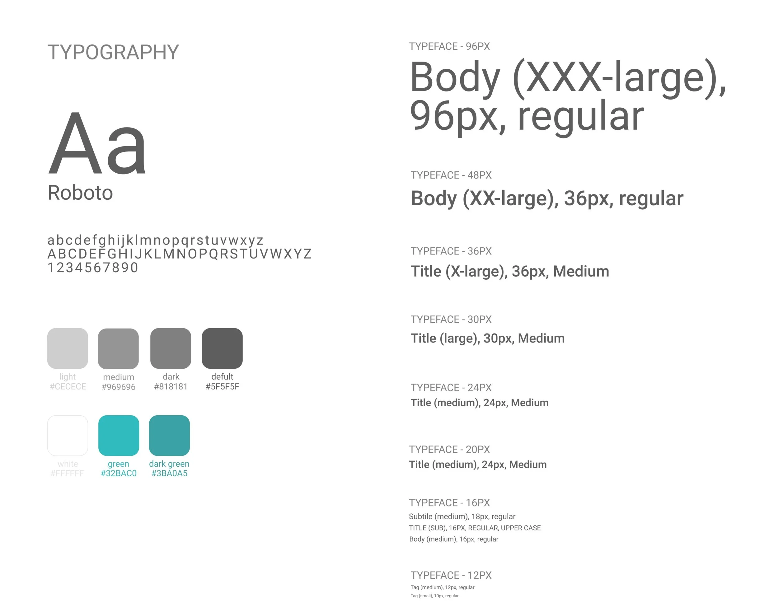
Choose Color & Typography

Base on the characteristics of each tea drink, I designed a set of color and geometric patterns to indicate:

  • Bubble-tea flavor: light warm-tone color, with brown circles on averagely, indicating bubbles.

  • Thai-tea flavor: orange base with gradient color change at the bottom to indicate tea sediment of the Thai tea.

  • Matcha-tea flavor: a thin layer of light green on top with irregular white circles to indicate bubble top of green tea.

  • Earl-gray flavor: kermesinus color base with groups of mulberry color stripes, which indicates tea leaf of the earl gray tea.

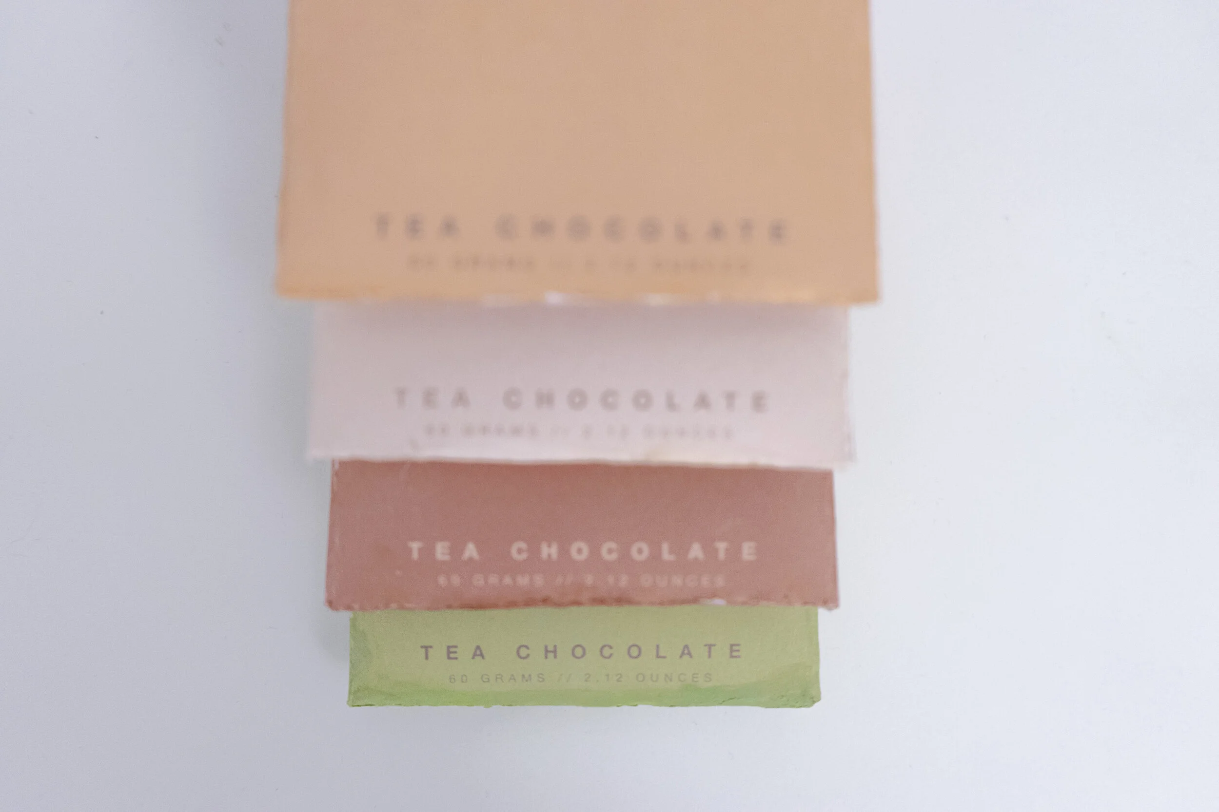
Below is my final print version for the packages with four flavors:

View fullsize Choco 3rd_Page_1.jpg
View fullsize Choco 3rd_Page_2.jpg
View fullsize Choco 3rd_Page_3.jpg
View fullsize Choco 3rd_Page_4.jpg
View fullsize Choco 3rd_Page_5.jpg
View fullsize Choco 3rd_Page_6.jpg
View fullsize Choco 3rd_Page_7.jpg
View fullsize Choco 3rd_Page_8.jpg
Choco 3rd_Page_9.jpg

I made the color usage table for this design. It contains the color parameters I used for each flavor and the geometric figures with their style. The table also includes the fonts, and a set of font designs for numbers and punctuation specifically designed for the latitude and longitude for the front surface.

Choose The Use of Materials

Based on the package’s cost, I decided to use 350g white pearl card paper, to have higher durability of the package, which has its unique glossy color to shine the illustrations on the package.

I also add embossment texture on the title of the front surface to highlight.

Galleries

(Click to view)

View fullsize Yu_Tong_Tiffany_Ling-1.jpg
View fullsize Yu_Tong_Tiffany_Ling-28.jpg
View fullsize Yu_Tong_Tiffany_Ling-36.jpg
View fullsize Yu_Tong_Tiffany_Ling-32.jpg
View fullsize Yu_Tong_Tiffany_Ling-31.jpg
View fullsize Yu_Tong_Tiffany_Ling-3.jpg
View fullsize Yu_Tong_Tiffany_Ling-4.jpg
View fullsize Yu_Tong_Tiffany_Ling-13.jpg
View fullsize Yu_Tong_Tiffany_Ling-5.jpg
View fullsize Yu_Tong_Tiffany_Ling-6.jpg
View fullsize Yu_Tong_Tiffany_Ling-7.jpg
View fullsize Yu_Tong_Tiffany_Ling-9.jpg
View fullsize Yu_Tong_Tiffany_Ling-10.jpg
View fullsize Yu_Tong_Tiffany_Ling-14.jpg
View fullsize Yu_Tong_Tiffany_Ling-15.jpg
View fullsize Yu_Tong_Tiffany_Ling-16.jpg
View fullsize Yu_Tong_Tiffany_Ling-21.jpg
View fullsize Yu_Tong_Tiffany_Ling-22.jpg
View fullsize Yu_Tong_Tiffany_Ling-23.jpg
View fullsize Yu_Tong_Tiffany_Ling-25.jpg
View fullsize Yu_Tong_Tiffany_Ling-27.jpg
Screenshot 2020-11-29 at 12.25.38 AM.png

Tea Project

March 22, 2020 in Product Design, Package Design

This project is to design a series of tea products. The design concept of this tea product combines the oriental tea culture to express the peaceful and far-reaching feeling of oriental people when drinking tea, that is, "禪(Zen)". To represent the feeling of Zen, I designed this set of tea products in an oriental style, combining Chinese calligraphy painting and bamboo materials.

The graphic logo adopts the form of Zen stones and is outlined with three brush strokes in the form of calligraphy. For the font of the English logo, the sans-serif font was chosen as the basis and added a little lining and embellishment to make the font mimicking an oriental classical style. The Chinese character logo is selected in the form of a calligraphy stamp, which echoes the calligraphy style of the logo, to present a consistent and complete calligraphy style as a whole.

My tea products include the brand logo and two products: tea bags and bulk tea. The design of tea bags includes packaging box design, tea bag pattern design, and tea bag shape design. The design of loose leaf tea is the design of tea cans, using bamboo, and porcelain.

Target

  • Consumer age range: 20 - 35

  • European and American market

  • Sale at souvenir stores in the art museums

  • Price range: USD $50 - $80

Logo for each type of tea

View fullsize t1.png
View fullsize t2.png
View fullsize t3.png
View fullsize t4.png
View fullsize t5.png

This set of tea products includes a total of five types of tea, namely 玄米茶(Genmaicha tea), ほうじ茶(Hōjicha tea), 抹茶(Matcha tea) from Japan, and 鐵觀音茶(Tieguanyin tea) and 龍井茶(Longjing tea) from China. Each tea is expressed in the form of traditional Chinese paintings with local characteristic teapots, such as Japanese Iron teapot, Kyusu teapot, Chinese Silver teapot, and White Porcelain teapot.

Tea Bags

  • The front of the teabag label illustrates the corresponding tea type, and the back is the brand logo.

  • To correspond to the positioning of the brand's oriental culture, the teabag label uses unbleached hard paper, which has a similar texture to rice paper.

  • Teabags also use translucent paper identical to rice paper.

  • Each tea bag is individually packaged. The front of the individual package is an illustration corresponding to each taste. The back of the package is the Chinese calligraphy display of the flavor and the brand Chinese logo.

  • The tea bags will be sold together in inboxes. Each box contains 10 tea bags.

View fullsize td.png
View fullsize pocket.png
View fullsize pocket(graphic.png
View fullsize teabag graphic.png
View fullsize teabag package.png
View fullsize package detail.png

Loose Leaf

View fullsize Loose Tea front.png
View fullsize Loose Tea back.png
  • Tea can design: bamboo lid, white ceramic bottle, and rice paper sticker as the seal.

  • The canisters are made of durable materials, which are designed to enable consumers to recycle and respond to the concept of environmental protection.

  • The jar body is cylindrical, with the teapot and logo on the front printed in English, and the name of the teapot and teapot written in the language of the origin of the tea name on the back.

Comment

Egg Package

Package/User Experience Design

Egg Package

February 22, 2020 in UX, Product Design

The project aims to design egg packaging that is convenient for production, transportation, and retail. To respond to the concept of sustainability, the choice of materials also requires the use of environmentally friendly materials.

Design goal:

  • Facility for factory production. The entire package is cut from a sheet of paper and only needs to be folded a few times to form.

  • Sturdy package to ensure good condition on arrival. The shape of the egg box is composed of several triangles because the stability of the triangle can protect the eggs well.

  • Convenient to demonstrate. The entire egg carton is also convenient for retail stores to place without wasting too much storage space.

  • Environmentally friendly. The material I chose is reusable recycled paper.

View fullsize Screenshot 2020-11-28 at 11.54.47 PM.png
View fullsize Screenshot 2020-11-28 at 11.55.02 PM.png

Process:

  1. Buy eggs from the supermarket and measure the circumference of the widest part of the eggs. 20 normal-sized eggs were measured and averaged from the data.

  2. According to the average perimeter of the egg, one side of each triangle bar is calculated to be approximately 2.85cm, and the total length of the paper bar is approximately 14.25cm according to the drawing. Through many calculations, I calculated the sizes of the drawings on the drawings (top left image).

  3. Make 10 egg-box models based on the calculated results (top right image).

  4. Test the drop resistance. The egg-box model filled with raw eggs was dropped from a height of 1m and 1.5m respectively to test whether the eggs inside would break. Experiments proved that the eggs used in both experiments were intact.

  5. Test the cleanliness of placement. Put 8 egg box models on the supermarket shelf and check whether it is convenient to put them.

  6. Ask for opinions. Give the sample to 10 participants aged 14-80 of different genders to experience, test whether the sample is convenient to use, and invite them to fill out a satisfaction questionnaire. According to the questionnaire, the average user satisfaction is 80%.

View fullsize IMG_0248.jpg
View fullsize IMG_0249.jpg
View fullsize IMG_0250.jpg
View fullsize IMG_0251.jpg
View fullsize IMG_0252+copy.jpg
View fullsize IMG_0252.jpg
View fullsize IMG_0253.jpg
View fullsize IMG_0254.jpg
Comment
 

Hi there! :-D

I am a UI/UX product designer dedicated to creating user-centered solutions that enhance everyday living. I hold a Master's degree from Carnegie Mellon University in the MIIPS program (2022) and a BFA in Communication Design with a minor in Photography from Parsons School of Design (2021).

I am a Lead Product Designer with 3+ years of experience in UX/UI design, product strategy, and cross-functional collaboration. I have delivered impactful solutions across industries such as AI, workforce analytics, marketplaces, smart home apps, and e-commerce, driving user engagement and product growth. Passionate about mentoring, user-centered design, and leveraging advanced technologies to achieve funding milestones and operational success.

—

👩🏻‍💻Previously worked @SOCA (2023 - Present) @CGI (2022 - 2023) @AlibabaGroup (2021) @XiaomiTechnology (2020) @UnitedNations (2019 - 2020) @Saatchi & Saatchi (2019)

—

🎖️Design Awards: Reddot Design Award - Brands & Communication Design 2023: XYG Window (02-06428-2023BC)  Product Design Award - Top Design Award 2022: Miles Trips Page Redesign. Product Design Award - C2A (Creative Communication Award) 2022: Miles Trips Page Redesign.